Gauge charts can be a great way to visualize data, and there are many different ways to create them. In this article, take a look at some examples to see how they can be used. Keep reading to learn more.
Best Uses for Gauge Charts
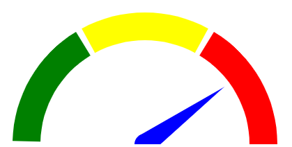
A gauge chart is a graphical representation of data that is measured against a scale. It typically has two or three elements: a pointer that indicates the current value, a scale that shows the maximum and minimum values, and a label that indicates the unit of measurement. These chart types can either be horizontal or vertical. Gauge charts can be used to measure anything from website traffic to stock prices. In general, there are three types of gauges: linear gauges, radial gauges, and thermometers. A linear gauge chart is used when the change in value is approximately proportional to time. A radial gauge system is best used when there is significant curvature in the data and thermometers are used when there is a large range of values that need to be displayed. There are several examples of when you should use a gauge system:
- Tracking your company’s progress against specific goals: A gauge system can be used to track your company’s progress towards specific goals. This can help you to identify areas where you need to make changes in order to reach your targets.
- Monitoring your company’s financial performance: Tracking your company’s financial performance over time can help you to identify trends and make changes to your business strategy as needed.
- Measuring customer satisfaction: This chart can be used to measure customer satisfaction over time. This can help you to identify areas where you need to make changes in order to keep your customers happy.
- Tracking employee satisfaction: A gauge chart can be used to track employee satisfaction over time. This can help you to identify areas where you need to make changes in order to keep your employees happy.
Formatting a Gauge Chart in Excel
When creating a gauge chart on your computer, there are three things you need to decide on: the type of gauge, the range for the gauge, and the value represented by the middle of the gauge. After deciding on those three items, you can start formatting your chart. The most important formatting item is the color of the needle. You’ll also want to format the background and text colors to match your company’s branding. To make your gauge look more realistic, you can add tick marks and labels to it.
Using Gauges to Display KPIs
Gauges are an effective way to display key performance indicators (KPIs) in a spreadsheet. They allow you to quickly see how your business is performing at a glance. There are many different types of gauges available, so you can find one that best suits your needs. One popular type of gauge is the speedometer gauge. This gauge displays data as a percentage or value on a scale that ranges from 0 to 100 percent. The speedometer gauge is ideal for displaying KPIs such as customer satisfaction or website traffic. Another popular type of gauge is the thermometer gauge. This gauge displays data as a temperature on a scale that ranges from -20 degrees Celsius to 120 degrees Celsius. The thermometer gauge is ideal for displaying KPIs such as sales or profits.
Adjusting the Scale of a Gauge Chart
There are two ways that you can adjust the scale of a gauge chart in Excel: adjusting the minimum and maximum values or adjusting the tick marks. You can adjust the minimum and maximum values of the scale by changing the values in the “Minimum” and “Maximum” boxes in the “Scale Options” section of the Formatting pane. Or you can also adjust the tick marks by changing the value in the “Tick Mark type” box in the “Scale Options” section of Formatting pane.
Gauge chart examples can be used to provide a visual representation of the relative magnitude of a given value as it compares to other values. This can be helpful in understanding the overall trend of the data or the magnitude of a specific value.